Sunday 8 December 2013

Mindmaps of initial ideas + Artist links and developments

Just the other day when we finished with our artist research, we began to create few mindmaps that would help us decide which area of interests we should go for. We have thought of three, essential to us all categories; Enjoying Youth, The End Of Summer and Being Close To Friends And Family, all have something to do with all of our memories. On each of those, we gave our own ideas of how we could possibly develop those main ideas/themes. If we had no ideas of our own, we could also develop our peers ideas instead, or change them. At the bottom I am presenting all those three mindmaps.

We all obvoiusly have many memories to do with Enjoying Youth, however none of those ideas were as menaingful to us, to be able to influence on our next steps in our future works. My writing is in green, at the above image I gave ideas of perhaps old photography that could be recreated, recreate funny things you did as a child, focus on birthday parites with children, baloons etc, most vivid memory that affected who we are today, and I have also added to Eva's dancing, perhaps a storyboard of movement.

The End Of Summer is the one that has particularly affected my peers Johnny's choice, which was of course difficult for us all to get back on track with work, however his memories were the strongest in this particular idea/theme. The ideas that I added onto this mindmap were to Eva's ideas, such as the one about a plane flying across the sky, I added one side beatch and school on the other, also I added two head one of which is with partys, music, beach etc and the other with books, class and education.


Being Close To Friends And Family has affected my choice quite a lot. I am increadibly close with my family as if they were my friends, which has therefore influenced me to create my final piece about someone important to me, from my family. At that point I knew I was going to focus on my uncle (Godfather), who I have visited every two days regularily throughout the whole summer, due to the condition he is in. The ideas I gave to this mind map were the symbolic jewelerry, family meetings etc.


Those three mindmaps, plus the artist analasys have then led to another, A1 sized mindmap of how do all my artists link with one another (or perhaps how has one led me to another) and how have they developed my personal theme Memories. Everything started from Audrey Flack and Andy Warhol who both use actual objects that present their memories and display them yet in different forms. This influenced me to collect objects that would present my memories throughout the summer, which does not mean that this would be my final project, yet that it was just the begining, that I would then use in my future works. Secondly, I moved on to Howard Hodgkin and Charles M. Russel, who particularly focus on the use of colours and how do they emphasise their memories. Thanks to which I know that colours imply a lot, almost everything, it is possible for the viewer to create a story if properly read, therefore has influenced me to use a form of colour in my final work, wheather it's still, light, reflection or liquid. Thirdly, I moved on to Peter Calessen and Else Mora, who use paper to create their outcomes, usually realistic patterns such as humans, story tales, angels and skeletons. This has influenced me to also create my work as a 'cut out' piece. Not particularly from paper, yet at that point I was mostly influenced by paper. This has then led to my final artist research of Ebon Heath and Tom Phillips who use literal words to emphasise their meaning. Heath cuts words from paper, which is how he links to Calessen, which has then moved on to Tom Phillips that covers all words within a text, leaving out the essential words to him. These two in the end have influenced me not to cut shapes out of a material, yet to cut words, as then my work would be literal and not metaphorical as most artist works are, however then I decided to create my work from wax, therefore the words would be shaped from hot wax, and then transformed into the shape of a candle, linking all the ideas together.

Sunday 24 November 2013

Window Proposal

The theme of my project is 'Memories'. By collecting primary resourses, I collected objects throughout the summer and kept them in a box, objects such as photos, a top, a bow, a calendar, a candle etc. I also kept a journal throughout the summer, annotating, adding photographs, tickets, food packs, drawing and painting, to present every single day of my summer. It was all my own personal primary research. Me and my peers Johnny and Eva created 3 mindmaps of different subthemes, which were about the obvious that we all went through during the summer, which were; 'Being close to friends and family', 'The end of summer' and 'Enjoying youth'. We all gave several personal ideas to each subtheme, yet in the end we all chose our favourite that linked to our memories the most. I decided to go with 'being close to friends and family' as my experience during the summer was only surrounded by those two.

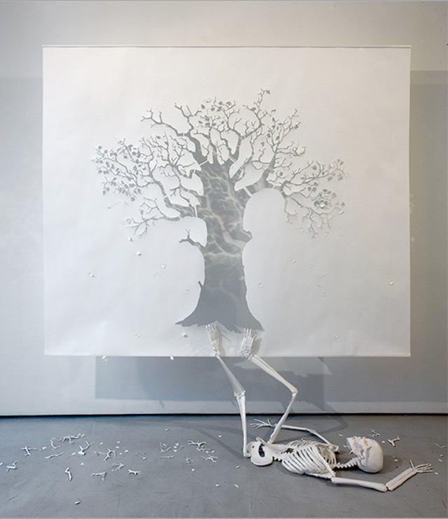
When I came back to school, I began to create an artist research and found 8 artist that all link to my theme in several ways. At first I researched Andy Warhol who linked to my theme by the collection of objects that meant something to him and kept them all in boxes, which I have then linked to Audrey Flack, who presents objects in different compositions very thoroughtly, linking to my idea as once again, she collects objects and uses them to emphasise her memories. These two artists perfectly link to my summer box, which gave me the idea to chose my one object from the box and expand it further in m future artist researches, however at that time it was too early for me to chose that one particular object.  Then i moved to Howard Hodgkin, who uses colour to emphasise his meaning or memory, yet doesn't explain what his works are about. Due to the memories emphasised through the use of colour, I found a relative artist to this idea, Charles M. Russell, who enhances colour to enhance his memories, from what he saw when he was a little boy, living between cowboys. The painting techniques of Hodgkin and Russell are completely different from one another, Hodgkin is dreamy and distorted, whereas Russell's is realistic, yet the idea of emphasising a feeling or a memory through the use of colour are very similar aspects of both of their works. This research showed me that I do not have to use an actual object to present my idea, I could use colour to emphasise the meaning just as well as the feeling that I felt in a memory of mine. Then I moved to Peter Callessen who cuts patterns from paper focusing on the idea of Life and Death. I linked this idea to my theme and came to a conclusion that most of my summer I spend at my uncles (Godfathers) house, keeping him company as he suffers from uncurable cancer. The idea of Life and Death made me think of my uncle straight away, as this was the most powerful and meaningful memory to me, this made me think that I could expand this idea further. In reference to Callessen's work, I found Elsa Mora's work who also cuts patterns from paper, transforming them into childhood stories such as Red Riding Hood or Alice in Wonderland. She does it to emphasise her childhood memories. The idea that I took from her work is if I plan to use paper in my final work, I should use colour to emphasise the feeling behing my work, which also links to the ideas of Howard Hodgkin and Charles M. Russell. The final artist I have researched is Ebon Heath, who cuts words from paper transforming them into a big pattern/sculpture, which I could use in my work to use the literal emphasis of an idea, and the pattern I would then transform the words into would be metaphorical. In my view, this is an amazing idea to consider in my final outcome. I have also used Tom Phillips to relate to Heaths work, as Phillips chooses meaningful words from a text, scraching all the words around them, emphasising that the meanigful ones should only stand out. This gave me an idea that instead of choosing random meaningful words, I could use this technique to circle words that in the end create a sentence that would be meaningful, which I could use in my final project.

After collecting such research, creating mindmaps and connecting the ideas together, my work will be about my uncle suffers from uncurable cancer, the idea is to emphasise happy memories I had with him and hopefully will through the literal use of words, metaphorical use through the shape of a candle and metaphorical use through colour. All will emphasise hope and that no matter what is happening now, as long as the light on the candle will burn there will always be hope for the better. I will use a candle from my box (Warhol/Flack) which I collected at a cementary at my aunties and uncles when I went with them to visit my greatgrandparents, which are their parents. I will use wax to create words/sentences (Callessen/Heath) from it at a large scale and transform them into a shape of a candle. The idea of wax initially came from the use of an actual candle. However, after the consultations with many different people, I came to a conclusion that wax on its own has a lot more meaning to this work, it could imply how fragile the situation is, yet as long as its taken care  by the happy memories and experiences, it will stay strong and so will he. I will also use colour (Hodgkin/Russell) either through the use of light, background material or colour of wax, to emphasise how I felt when I spend the happy moments with him and the ones I hopefully will. However, I still have a problem with the choice whether which one I should choose, or if I should perhaps use it all.

Before researching new artist after another, I always had different ideas influenced by them, that have always expand each time I researched a new artist, wheather it was the meaning or the technique. For example, after researching Warhol, Flack, Hodgkin and Russell, my plan was to focus on the momories I had with my boyfriend during the summer and the fact that our relationship was a long distance one, which is of course very meaningful to me, yet I still did not know how to clearly show it. After, I researched Callessen, who has completely changed my idea onto the theme of Life and Death which is a main theme of his work, however it has influenced me a lot to focus on my uncle instead, who is my family. Next researches of Mora, Heath and Phillips was nothing but the enhancement, improvement and most importantly inspiration for the idea of my uncle. The idea has slightly changed from life and death onto hope, and technique from the use of paper, onto the use of wax.

The location I will place my work in will be a window placed in my school, right at the front of the main entrance on the left wall, where everyone passes and can clearly see it. There are four windows right next to each other on one side, mine is second from the left, Johnny's third from the left and Eva's fourth. The measurements of the window are; height 60cm, width 29cm and length 35cm giving me a wide space to create a massive, 3D, strong piece of work. Large space on the inside, divided from other windows through a large board, the outside frame of the window is wooden (light), with a lock therefore no one will be able to open it apart from me, and a glass window, dividing the outside from the inside, therefore all locked up yet allowing the viewers to see the work clearly.

I have created three different sketches of how the work may look like, first one presents an average sized candle, fire hanged from the top, material/fabric all over the walls and the background, with lightning coming from the bottom. Second sketch shows a candle that's tall enough to almost reach to the ceiling of the window, which would allow me to create more words/sentences, everything else would be the same. Third image shows the words/sentences of the candle being slightly bend, creating a dreamy feeling of the candle, yet even though wax is easy to manipulate when mented, creating words that all together are bendy will be a very difficult task to do.


The materials that I am planning to use in particular is wax, I do not know yet weather it will be plain white or coloured wax. The whole sculpture I am planning to create will be made from wax. The background will be a large piece of black or white fabric, that will be covering the whole base of the window, the back, sides, bottom and if possible the top part over the ceiling. I am mainly considering a black background due to the fact that when I use lighting, it will only bounce off the wax, and the background will stay clear, whereas on white, the colours will bounce off the walls just as well as of the wax. However, the main problem is that if I use black then it will give a dark, sad, depressing impression to the viewer, and that is certainly not what I want to emphasise, as I do not want to focus on the sad aspects of his life yet on the happy aspects and memories that will give him hope. The lightning will be used either way, whether I use coloured or white wax, white or black background, I will use white light (as long as it does not end up being too hot, not to melt the wax) in purpose of the meaning to emphasise hope, and technique for the light to bounce off the wax and perhaps the background, depending on their colours.

What I must focus on however, is the maintainance of the materials I am planning to use. For instance, the light will be probably charged by the battery, meaning that when it runs out I will have to change it every once in a while. Fabric from the walls, if not attached properly it may fall anytime, risking that it will ruin my whole work. Therefore, it is increadibly essential for me to make sure that the fabric will be properly attached to the walls. What is also important is the thickness of the letters of the wax, if it ends up being too thin, it will break easily, which will be a massive problem as I want one line of words/sentences to be almost as long as one meter. Therefore, I must make sure that the letters are thick, carefully joined enough for them to stand straight, however, to make sure that it stays still, I could also put a line of wire behind the line of words, drag the wire all the way to the eiling, keeping the wax still and yet still not recognisable to the viewer, unless if they look closer. However, I could also use a metallic string, from the wax to the ceiling so that it was not recognisable by the viewer, and normal wire behind the words.

I do not want to use a lot of the wire, just about 10-15, one meter long pieces of wire to attach to the back of the wax, this should cost about 5/10 pounds. The fabric will be quite a large piece yet thin, easy to rip, therefore should cost about 5 pounds. I will use a large amount of wax to create the words/senteces, depending on how large the font will be, will depend on how much I will use it, however, by the size of the window, to be proportionally correct, I will use a large amount of wax, which should cost about 10-15 pounds. Plus the plastic frames for the wax shall cost about 5 pounds.

In conclusion, as always during the making something always ends up being changed, hopefully, after I create the testers, and everything will work just the way I hope it to, the whole project will end up looking just the way I wish it to. 

Monday 18 November 2013

Ebon Heath + Tom Philips + Response

Ebon Heath.

Ebon Heath lives and works between Brooklyn, Bali, and Berlin. He received his BFA, in Graphic Design, from Rhode Island School of Design in 1994. He founded (((stereotype))) the same year, a design studio focused on music packaging, magazine layout, and fashion advertising. He subsequently cofounded Cell Out in 2003, a consultancy that develops issue-based media strategies for non-profits, NGO’s and brands. He has exhibited internationally with his typographic mobiles, installations, jewelry, and performance art making letters come alive. He is a visiting professor in Graphic Design at Lehman College in the Bronx (USA) and an occasional Art Director for the Mindpirates Berlin (DE). Ebon does not sleep often yet tries to remember his dreams every day.


When I look at this work, I think of how amazing it is, stunningly composed, imaginative, unique and yet simple. His works are installations that are made of laser cut or hand cut letters and words put together in complex, but harmounius tridimentional structures which have been described as poetry to see. His work has been termed as illustration, sculpture and product design. This work in particular reminds me of Peter Callessen's work, who also uses the technique of laser cut or hand cut patterns, that then become 3D, distorted metaphorical images presenting a high contrast in between life and death. However, only the technique is a similarity to Heath's technique, as he cuts out letters and words to emphasise poetry through the illustration of sculpture. I like the way he uses letters/words in his work that could emphasise music or poetry. Therefore, quite deep and sensitive topics. The font in which he cuts out the words may link to that idea as the words are small, which may emphasise the softness and deepness of the music and poetry. The letters are cut carefully in detail as they are sharp and very clear, implying how hard working Heath must be. Most of the time he uses black and white in his compositions, perhaps implying that the meaning is dark, serious, meaningful or deep. He does use colour in some of his works yet in my view, with colour they do not give the same effect to the viewer as the black and white works do. However, it does work in the example above, with a black background and gold writing, presented in a form of a chandelier with an actual artificial light inside, making the image more realistic. The fact that it is in a form of cut words/letters, makes the image more interesting and unique as I have never seen this type of work or idea before. The effect of formal elements makes me as a viewer interested and impressed by it. This is because he composes those very carefully and thinks clearly about their effect on the viewer. For example, the use of gold, lightning and black background, seem posh and rich due to the mix of black and gold. Therefore, creating a expensive, pricy and rich impression to the viewer. The factors that interest me the most in his works are the detailed letters and that they could say absolutely anything and mean something absolutely different is a very interesting aspect of his work, which owerally is the use of mataphor.

I think that through his work he tries to imply poetry that appears in an actual verbal form, which could mean one thing, however, the pattern/shape he then puts them into could also have an impact on the meaning of the work. I think he tries to combine those two separate factors into one meaningful piece of work, which would certainly be a fantastic idea. I think the artist tried to emphasise that whenever you try to emphasise an idea through art or in any other way, it does not have to be through metaphor, it could be literal instead, showing exactly what the meaning behind the work is. If I had the chance to ask the artist anything, I would ask him what is the connection in between the words/letters and the shape they are being trnsformed into? What is the exact link in between the two? I think this work is relevant to my project because of the technique, and the many different ways I could use it in my future works or the final outome. It's quite fantastic how I can use the technique of literal words to imply my memory, I may also use a metaphor within the shape I put the words into, which is an amazing aspect of his work that I believe should be certailny considered. However, the work does not link to my theme within it's meaning, which is to imply music and poetry, whereas mine is about memories. 

If I could name this work, I would give it the title 'rich poetry', because of the poetry/music/words used within the work and the mix of gold and black giving a rich, posh and expensive impression of the pattern the words have been transformed into. I would like to compare this work to Tom Philips works. Born 24 May 1937 in London, Phillips is an English artist, where he continues to work. He is a painter, printmaker and collagist. He chooses certain words that are meaningful to him from a piece of text and then crosses out the other irrelevant words. The use of literal words is similar in both cases, the words being meaningful is another similar aspect of it, yet the way they are chosen is certainly different.

Tom Phillips.


The elements that I think are successful are the use of visual vocabulary that is actually literal to the meaning that it is meant to imply. The fact that most of his works are white has also worked quite successfuly as there is no distractions, the viewer only sees the lettering for what it is. However, the elements that I don't think are successful is the meaning, that he tries to get across which is not so much for a meaning, but simple poetry/music/words, whereas in my view, if he got more into the meaning, and started writing his memories, perhaps stories that hes been through, the work would in that case perfectly link to my theme, and also would have certainly gained more meaning. My mother said how in her view this work is 'interesting to look at, however she doesn't like the fact that the words are random, if it was a story it would have more sense and meaning', I think she said it because it is true, the words seem to be chosen at random (even if they probably weren't) yet still, a story written out then transformed into a shape, would be more interesting than random words that the viewer does not understand where they came from. I think the factors that are worth remembering is not the the visual vocabulary, yet what they are then transformed into, and what is that transformation meant to imply, perhaps it could be a type of a metaphor.


Sunday 3 November 2013

Metaphor + Response

Metaphor is a term for a figure of speech, which does not use a word in its basic literal sense. Instead, it uses a word in a kind of comparison. We run, and we also say rivers run. We may run into trouble, especially if we run up a bill at the bar. Therefore a metaphor uses words to make a picture in our mind. It takes a word from its original context and uses it in another.
"I beat him with a stick" = literal meaning of 'beat'.
"I beat him in an argument" = metaphorical meaning of 'beat'.
Metaphors are an essential part of language: it is not possible to speak or write without them. A simple example is the word "run". This has a basic meaning of "moving quickly" or "go with quick steps on alternate feet, never having both feet on the ground at the same time''. We use metaphors to make indirect comparisons, but without using 'like' or 'as' – because that would be a similie. A simile is a direct comparison: "Jane is like a child". A metaphor very often uses the verb'to be': "love is war", for example, not '' love is like war". Poetry includes much metaphor, usually more than pose.

A metaphor could be used in art through different forms. We as a class chose random words that could then present in a form of metaphor in a drawing. ....presents the word 'headphones' and development of each idea. Same with other words, which are vacum cleaner and the energy drinks, from which I had to think of the literal meaning of each word and try to create a metapor out of it. For instance, head phones, taking it apart would be 'head' and 'phone', therefore I presented a number of ideas that could present it, that are presented below.


Image on the bottom right presents a metaphor of headphones, the top two however an energy drink.


All the top images present headphones, yet the bottom ones of the spirarals and tornado present a vaccum cleaner.


All the images on this paper simply present an energy drink.

Peter Callesen + Elsa Mora + Response

Peter Callesen, born in Copenhagen in 1967, is a Danish artist and author. Callesen is most well known for his talent in creating paper cut artworks which combining the minimalism of a big crisp white sheet of paper with the complexity of carefully cut and folded paper.

''A large part of my work is made from A4 sheets of paper. It is probably the most common and consumed media used for carrying information today. This is why we rarely notice the actual materiality of the A4 paper. By taking away all the information and starting from scratch using the blank white A4 paper sheet for my creations, I feel I have found a material that we are all able to relate to, and at the same time the A4 paper sheet is neutral and open to fill with different meaning. The thin white paper gives the paper sculptures a frailty that underlines the tragic and romantic theme of my works. The paper cut sculptures explore the probable and magical transformation of the flat sheet of paper into figures that expand into the space surrounding them. The negative and absent 2 dimensional space left by the cut, points out the contrast to the 3 dimensional reality it creates, even though the figures still stick to their origin without the possibility of escaping. In that sense there is also an aspect of something tragic in many of the cuts. They deal with dreams and the impossible. But the stairs and ladders represent a more fragile and almost sublime form. The trashy style in earlier works has developed into a more precise aesthetics. These works exist in the gap between the recognizable everyday object and the fragile and spherical condition and material in which they appear. The whiteness, the ideal pure copy of something real as well as the vertical direction coherent in most of my paper works, could also indicate the aspect of something platonic or religious.''
http://www.petercallesen.com/about/


He uses simple A4 white piece of paper, unless if he decides to create a missive piece of work, then he may go up to the A1 size, which is absolutely massive. What I particularly love about his work, is that he creates his works in such detail. It is difficult just through the use of a cutting knife to create such image out of an A4 piece of paper. Few of his works have a colored background such as the presented image below, perhaps he tries to imply what he felt at the time of making through the use of color, or tries to attach a color that would look the best to what he tries to emphasise, for example flowers in a vase at the bottom, due to it's red background they seem to be placed at home. Also the fact that he creates a background image that is large enough to cut out a smaller one in it, makes the work fascinating and memorable through being unique. Bending the pattern made the image into 3D, being a very interesting aspect of his works by being realistic through the use of an angel and skeleton, which are perfect in presenting the contrast between life and death. Yet still dreamy as no one has actually seen an angel before, nor a skeleton with wings, therefore implying he uses a metaphor to emphasise the meaning. The use of the formal elements makes the viewer more interested in his works, due to the uniqueness of the paper use and the meaning of contrast of Life and Death behind it, interests the viewers.

What I believe is truly going on in most of his works, is all about the contrast in between life and death. Perhaps he tries to tell a story that happened in his life through his works, perhaps someone special to him has passed away and tries to emphasize it through the contrast of life and death. I think this because most of the time he presents angels and skeletons, certainly a massive, contrastingly imagery between heaven and hell, linking to religious imagery. However, his overall meaning is about life and death, not heaven and hell, therefore the works of angels and skeletons present his wonder of whether these objects or places exist, or where his 'special someone' went to after they passed away. Imagery of life and death are the ones presenting a life object such as cut out human hand, and skeleton created from it, showing high contrast i have mentioned earlier. 
If I had to ask Callessen about his works, I would ask who are they about, what or who has inspired him to create such deep and meaningful piece of amazingly detailed works. Also the fact that they are so incredibly detailed, imply that his work is important and meaningful to him. 
Even without his statement above, it is not so hard to realise that his works is about life and death, the metaphor of this theme implies it easily, showing he used the simplest metaphor to imply something so deep and missunderstanding to humans. However, seeing the idea of fairy tale or dreamy imagery to present something so realistic is harder to realise for the viewer on their own. Myself as a viewer for example, at first I got the idea of life and death, sadness and happiness as well as of the contrast, yet not of the dreamy emphasis. On the other hand, if I had to link this idea to my theme of 'Memories', thinking from this perspective, this idea could add even more meaning to his work just as well as mine. His work could emphasise his memories of perhaps his parents/grandparents/siblings/friends/love passing away, presented in a form of a dream that he could have had, and simply presents them on A4 white paper.  His technique is very interesting, detailed and particularly unique, therefore perfectly liking to my theme of 'Memories', in terms of presenting a contrast of the past and the presence and of a memory and how it changed.
If I had to title the work, I would name it of what it actually presents. For instance, if one of his works was about his parents and the work presented two angels or skeletons, I would therefore name it 'mum and dad' or 'parents', purposely, to clearer imply to the viewer what was my inspiration as well as the meaning behind it. This is because now as a viewer I only know the meaning and understand why he used such metaphor, however I do not know the inspiration behind them. For instance, the image below of a vase filled with dying flowers. When looking at this image i see a clear link to a human/animal/plant life, dying flowers could emphasise how as long as you're alive, it is inevitable that death will come. The metaphor of dying flowers is very well used as I as the viewer understand the meaning or message he tries to imply through it, however what I don't know is what has inspired him to create this work. Was it someone close to him that has passed away? Was it his pet? Or was it his love?

This work could link to Elsa Mora. In her art she explores themes of self-containment, relationships, family and passion and draws inspiration from personal stories and experiences. Mora developed her art while she was looking after her autisic child. She soon realized the value of being extremely patient and consistent, and these qualities show in her incredibly detailed papercut works.From Elsa - "My goal is for each student to experience this fascinating medium in a fun way. My hope is that they will feel inspired to keep exploring this medium so they can create their own unique works of art. My hope is also that the students incorporate papercutting in their regular lives as a way of relaxation. But if I had to choose one thing that blows my mind that would be people. Think that we are millions of people on this planet, and each single person is unique, even if they are twins. I love different cultures, languages, the way we look, and the way we think and relate with each other.''
The technique in particular links to Callessen's work yet slightly changed. She uses colour in most of her works, presenting her memories, therefore linking to my theme of 'Memories'. I like how she links the imagery with the writing, such as in the image presented below of the red riding hood, it's obvious that it's the story due to the forest, little girl and the wolf, however the writing at the top 'Once upon a time', makes it absolutely clear to the viewers that she tries to present her childhood probably favorite story. However it does not exactly must be her favorite childhood story, could be her children's instead. On the other hand even though the technique is almost the same, the meaning behind the work is completely different from Callessen's, however still links to my theme. She focuses on presenting 
self-containment, relationships, family and passion and draws inspiration from personal stories and experiences, whereas Callessen focuses on the contrast in between Life and Death. However her meaning still links to my theme of 'Memories' as it's all about relationships, family and passion that we went through in our lifes, and that is what my theme is about, is about the experiences in our life that are so powerful and meaningful, presented in a form of a metaphor.


In my opinion, technique is the most interesting aspect of his work when looking first at the work. Personally, when I first saw his works, I was excited and incredibly interested from the first moment, which was caused by his unique yet simple technique. The idea of the technique use is amazing yet still created from a simple piece of paper that people use everyday, however he thought about it and created something amazing from it. That is only the impression the technique creates. The meaning has excited me about this work even more, those two aspects perfectly link with one to another, creating inspiration for people such as myself. Therefore I believe his work is very effective in what it was meant to show or emphasise from both, technical and meaningful aspects. The only issue with his work is that once again, as a viewer, I do not know the inspiration to his creations.
My class peers Johnny and Eva have also analysed his works and gave their own opinion about Callessen's works. Eva said how she particularly loves how you can't tell the size of the actual work when looking at the image of it. Which is true, she analysed the image below and said 'I love how you can't tell the real size'. Whereas Johnny said how detailed it is and loves the presentation of a story, in a story tale form,. Also how interesting the base of an image is, because you can't really tell what will come out from the cut parts, however when it comes together into one big piece, it all starts to make sense, creating something beautiful and amazing.


What I think is worth remembering about his work is his technique, because it is unique and very interesting as I have explained earlier. Also in my case, remembering the idea of life and death, particularly links to my personal memory of my Godfather, who at this moment suffers from incurable cancer and each time I see him his condition gets worse. This is what I have experienced over the summer, being the most powerful and meaningful memory to me, linking to Callessen's idea of life and death, painful, yet most essential memory to me.


I have experienced the difficulty of cutting paper myself when creating responses to his technique and meaning of focusing on life and death though a dreamy/fairy tale form, combined with my own theme of memories. First response presents a memory of myself being on a cementary, visiting my greatgrandparents, the angel and the grave of course emphasise the idea of a cementary, of life and death linking to Callessen's meaning, also links with his technique. Second image is a metaphor of time running out, this is presented by a burning out candle, that fades with time. This memory is ment to represent my uncle/godfather, who has uncurable cancer, this candle is a metaphor representing him, which is a very sad memory as each time I see him, his condition gets worse, therefore in my view the candle is a perfect emphasis to this memory. Same idea applies to the 5th and 6th image, with a candle burning out, yet instead of creating a storyboard, this time I've created a burned out candle from a new, just freshly burning candle, yet the idea and memory behind it is still exactly the same. Whereas the 4th image presents a couple dreaming of being together, emphasising that they are having a long distant relationship. What I hope implies it is the sunrise on one side and sunset on the other, presenting two different places at two different timings.


Monday 14 October 2013

Color Theory + Response


In todays lesson we created a colour wheel of our own, focusing on what each color represents, which could either be a meaning, object or a feeling as a little response of the research presented above.


Our next task (after creating a powerpoint about color theory) as a responce to colour research, was to recreate our memories from the objects from the memories box, through the use of color. Color is the factor we were ment to focus on at all times. Then create a painting based on our memories yet presented by color. I had to focus on how colors made me feel, therefore the powerpoint on color theory happened to be very usefull, as I have studied of what different color represents. For example red emphasises, energy, excitement, passion, love, power, blood, war, violence etc, therefore to interprate the right meaning, I had be careful on how I used the colors. Therefore I have created about four different paintings, each representing a different memory which was either taken from my memory box or the journal I filled in during the summer.

This painting was the first I created, and it represents a memory of myself being on my friends 18th birthday party. This moment presents me sitting on the ground, sorounded by the wind, and there are many reasons for why I chose this particular moment and most importantly why I chose those colors. The use of red and orange is caused by the fact that this memory was inspired by an object from the memory box, which in fact were Doritos chrisps, that have a red and orange pack. Whist I sat on the ground I ate them with my friends, yet there is more to the story. Those warm colors also present excitement I felt at that time, the party was fun, and I've spent amazing time with my friends. Therefore the use of yellow emphasises the joy and happiness I felt at that particular time. Also, I was not sitting alone yet with a friend of mine that has feeling towards me and tried to flirt with me, that is what I presented in a form of pink wind. The reason I chose it to be pink is because pink symbolises love, romance, caring and tenderness, therefore I thought this color would be perfect to present his feelings towards me at that moment.

This happened to be the second painting I created. This time however, I recreated a memory from my journal, from it's very first page. Page presents a lot of images of myself and my boyfriend, messing around, whilst my mum took photographs of us. This is a very powerful memory, and very meaningful to me, therefore I thought it would be the best to represent within a painting, as I would put a lot of meaning and effort into it. I am happy from this painting because it emphasizes everything I felt that evening. I felt happiness, joy, closeness, hope (yellow), excitement, filled with energy, passion, love and desire (red which covers most of it), balance, enthusiastic, warmth (orange also covering whole background). That is exactly how I felt that night, huge, energetic and passionate love. Besides the fact that we were joking around with my parents made it even more meaningful to me, thanks to which this memory is very important to me, and I truly believe, these particular colors have presented that memory perfectly.


Once again, I have overused the colors of red, orange and yellow. In my third painting I have presented a bow which I got from my cousin who lives on the countryside, I went there with my whole family and boyfriend for her mothers birthday. Once again the colors match exactly what I felt that day, which was also caused my the fact that my uncle let us drive his quad around the village, which happened to be the best moment of the whole evening. This memory was also taken from the summer journal, and this painting is ment to present driving on the quad. Same as earlier, the colors are emphasizing the exact same meanings, yet with a bit of change, I added green as the background. This is because what I also clearly remember from that day was that we were on a countryside, no cities, no buildings, no roads, just nature, silent, calm environment. Therefore green in my view, is a perfect color for the background, as the actual background at my aunties place was filled with green and nature.
Last painting contrastingly does not present such a happy memory, I have also chosen it from the memory box as well. I painted a burning candle, most with dull colors such as black and grey. The reason for the dull coloring is because this candle represents the day I went to the cementary with my closest family, to visit my greatgrandmother and greatgrandfather. It is a sad memory as my nan and her sisters began to tell eachother stories from their childhood, therefore began to cry. There is a high contrast in between the happy and exciting memories from their childhood, which is represented by the use of pink, orange and red colors, and in between the dark side of the situation, where we stood on a cementary. This side of contrast is therefore presented by the use of black, grey and a bit of white.


Saturday 7 September 2013

Howard Hodgkin + Charles M. Russell

Sir Gordon Howard Eliot Hodgkin was born 6 August 1932, he is a British painter and printmaker.
His early paintings tend to be made up of curved forms and a limited number of colours. Around the beginning of the 1970s, Hodgkin's style became more spontaneous, with  recognisable shapes presented in bright colours. His works are often compared to the paintings of Henri Matisse.
                            Howard Hodgkin  In an Empty Room

The black and white lines do present a sense of being in a room, as he didn’t paint it fully flat, yet     made it into a 3D structure. Where the arrow points for example, it points at a corner of the room because the lines show a distorted ‘L’ shape which would eventually make a 2D painting. However he did add a third line on the bottom going towards the right bottom corner, giving the image more meaning and also more interesting as the viewer may feel as if they were inside the empty room. Green lines surrounding the image as if they were a frame,is a very common factor in Hodgkin's paintings. He either paints over the actual frames which is also very common, or paints his own within a painting. This could be purposed for making the image visually smaller, or perhaps could create a form of an optical illusion, where the viewer stands far from his painting, doesn't see a green frame, yet sees a green color blending in from all sides with the painting. On the other hand Hodgkin in this case has used a red splash on the lefttop corner, implying how he has clearly thought of the use of the colors red and green as those two particular colors that are very often put together that could emphasise many different things. For instance in this painting Hodgkin could imply the opposites. Green usually gives a positive concept such as accept, agree, complete, yes, on, up etc, whereas red that usually gives a negative concept such as reject, disagree, incomplete, no, off, down etc. On the other hand in the European culture, colors such as green and red put together, imply Christmas. Therefore the story of this painting could be him, being in an empty room during a christmas evening.

                                                                      Deep Water.

This painting on the other hand, does not give a sense of space withing the actual painting as it does not containg any foreground nor background. It's a fully 2D image. However, Hodgkin does create a sense of deep space within the work by the use of the frame and painting over it. As the frame stands out more than the actual painting, painting over the frame as a continous spreading image, gives a sense of space in it, creating a unique 3D painting. What makes this painting more natural or realistic is the use of blue paint to present water. Hodgkin has mainly used a baby blue and a dark blue to present water, I am also guessing that the danrk blue presents the deep part of water, the lighter the color gets the more shallow the water is. The way he presented this painting, considering paint over the frame as well, this gives a very chaotic impression to the viewer, perhaps he tried to present anger that he felt, through the use of stormy water, as it presents chaos, noise and mess.

I think his art works are about something so personal to him that a viewer will not understand, perhaps this is the purpose of his paintings, to present something that may seem to be so complicated to the viewer, yet so simple to him as he is the only one who knows what the work is about. If I had the chance to ask the artist a question, I would ask him why is he creating work that viewers do not understand? It's good to know the meaning to yourself, that shows how important the work is to you, but what is the point of publishing to the world, when no one knows what the work is about. Without meaning it is just canvas with painted lines over it. Meaning is important. I think this work is relevant to my project because it is about something meaningful to Hodgkin, which could be either a feeling or a memory or something that was going on at that particular time of when he created the work. He presents something increadibly meaningful to him, which is also a huge part of memories, most are meaningful, therefore, quite well linking to my theme of 'Memories'. However what does not relate to my project is the style he uses to emphasise his meanings, well at least I do not aprove it myself, in my view creating something meaningful to me even through the use of a metaphor, still should imply a meaning to the viewer, I want them to understand what my work is about just by looking at it and reading the title. Without them understanding the work looses its purpose, as then there would be no point of publishing it to the world.

The elements that I think are successful are his use of colour, which might just as well emphasise his feelings that he felt during the painting or perhaps what he once felt, and now he may try to present that memory of those feelings within his paintings. The elements I don't think are successful however, are his style of painting, which I do not understand. What I see are coloured lines on canvas but no image within. I do love the way he uses colour and comopses it, hovewer painting lines across canvas is certainly something that does not go with my taste. My mother has said about this work that it 'does not make sense, seems as if a child drew this, yet this is not the problem, I just don't understand what is going on in this painting', which I agree with as his works are difficult to read. The factors worth remembering are his use of colour, it is clear that he knows the colour schemes and is aware of how to mix different colours together so that they look good or perhaps create an optical illusion, such as the use of red and green, mixed have been known for perfect use for the optical illusion.

I would like to compare this work to Charles M. Russell, not because of the paintings that they create because they are 100% different from one another, however I would like to compare their use of colour, which I will analyse after the analysis of Charles M. Russell.


‘Charles M. Russell was born to moderate wealth. A native of St. Louis, Missouri, Russell first came to Montana as a boy of 16 with a dream of becoming a real cowboy. He was so captivated with the West he chose to stay and fulfill his childhood fantasy. During those first years in Montana, Russell received great encouragement from Jake Hoover, a mountain man who befriended him and took him under his wing. Hoover often shared his cabin with the young Charlie, sometimes providing food and shelter for months at a time. This friendship allowed Russell to experience the ways of the frontier life he would later portray so vividly in his paintings. Charles Russell felt deeply the passing of the West, the most evident theme of his art. This sense of loss touched him with an emotional immediacy. He was haunted by youthful fantasies, memories of what once was and by the evidence of change that surrounded him as an everyday reality. His work reflected the public demand for authenticity, but also the soul of a romantic.’

This is the first image of his that I saw, which has also caught my attention because of the way he uses colour (therefore being a perfect artist for my task). His paintings present reality, that he saw as a child, such as the image above presenting Indians, marching on their horses, however what differs him from normality of the paintings that present reality is in fact Russell's use of colour. The colours present true colours of nature that he actually saw, however what is really interesting about them is that they are incredibly sharp and therefore noticeable. His use of tone depends on the use of different colour, not the same colour with a different tone, yet with an actual colour change. For instance, at the very bottom of the above painting, shows the land that they were on, and what's very noticeable about the land is that it is brownish/yellowish, however some parts of the land are either white or black, these colours have been purposely used to show the tonal difference in the painting. All the lines that he uses are not so clear when it comes to the bright colours in the painting, such as the one below showing the sky/mountains in the background, because they are so thin. On the other hand, when it comes to the dark tones, speaking of the horses below and the men, in comparison to the bright mountains in their orange/yellow colours are much more stronger and powerful. Thanks to which are very noticeable.

Although, the painting below is completely different to the ones above. In fact it seems to be presenting a different reality comparing to the ones we have seen before. This is because the colours have changed according to the action in that painting. Earlier painting's I've shown were very aggressive according to their action and colouring, because they have shown men fighting, therefore Russell chose very dark, yet appropriate range of colour and tone, making the painting's very sharp and strong looking in the end. However, the one below is completely different. It is calm, peaceful, beautiful, showing a lot of nature and it contains very bright colours. Seems like action affected the colour Russell has used. In this case he has used very bright colours such as blue, green and yellow, creating a massive contrast in between the images we have already gone through and the one below. Similarly, what holds those painting's together in one style is the strength and sharpness of the use of colour I have mentioned before. The way Russell has composed them together, yet used a different colour to show a different tone. That sharpness and power keeps those painting's together.


I love the way Russell uses colour in his works, they are a bit enhanced, which would of course make sense as they are memories. Comparing his use of colour to Hodgkin's, I would say that Russell's is more realistic, which is an aspect that interests me quite a lot, whereas Hodgkin's are not realistic at all. However, maybe if I knew what was behind Hodgkin's painting's, it would be easier for me to analyse weather the colours he used go with his meaning, if they make the painting more realistic or fictional and if he uses colour to emphasise a feeling or a memory.


Tooting Bec Common collection


During that day, our task was to go to Tooting Bec Common, spend about an hour there walking around, collecting objects around us. We went to a coffee shop, playground for children, walked around the park, then stayed in one place took pictures, filmed, and drew what was happening around us.

What was important on that trip was to try and collect all five senses, that were surrounding us. For instance, at one moment we sat down, took photographs of each other, filmed and then drew what was around us, even our friends posing. Another example would be us collecting flowers and leaves as these were the main things that have surrounded us as we were in a park. We listened to music, ate a cace at a coffee shop and therefore discovered a lot of different surfaces. The whole point of this trip was to collect our Primary Research, wchich were the very first we have collected, so that later in out project we could use them as inspiration, or perhaps the idea of collecting memories. This was a very useful task as then we decided to collect objects throughout the whole summer, plus we also kept a journal, all in purpose of collection of the primary research.